Ravine
Ravine

Brand Identity
Brand Identity
Overview
Ravine is a premium lip brand rooted in modern romance and natural sophistication. This project was a response to the @readysetbrief challenge, and from the moment I read the brief, I knew exactly the world I wanted to build — one that felt rich, tender, and deeply feminine.
The Concept
When I think of lipstick, I think of colour that carries emotion. The deep reds, the ripe burgundies, the soft berries — shades that feel bold and intimate at the same time. That tension between strength and softness became the creative heartbeat of Ravine.
I wanted the brand to feel like a love letter. Not loud or flashy, but the kind of romance that lingers — like velvet, like the last petal of a rose. Every decision I made came back to that feeling.
The Creative Decisions
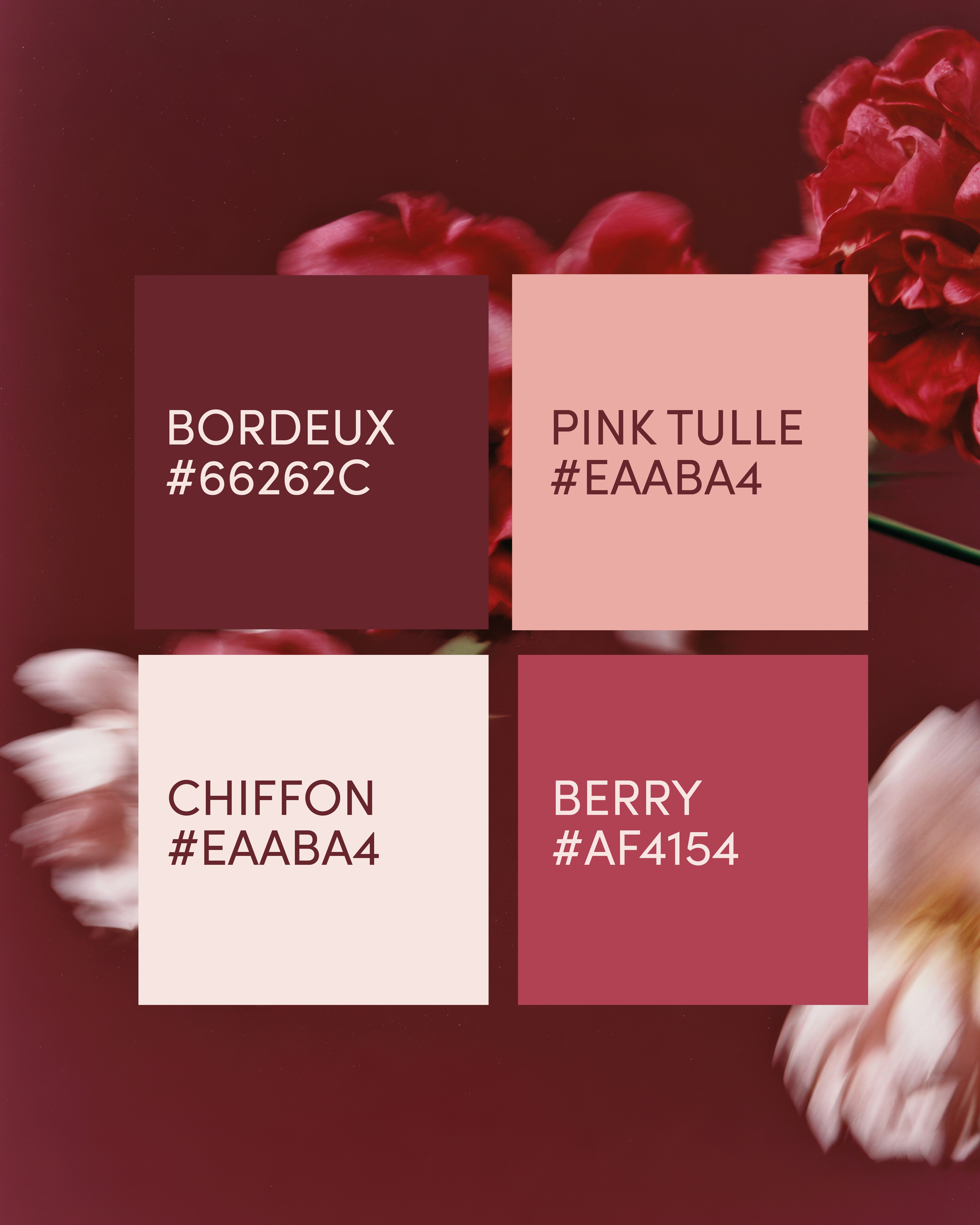
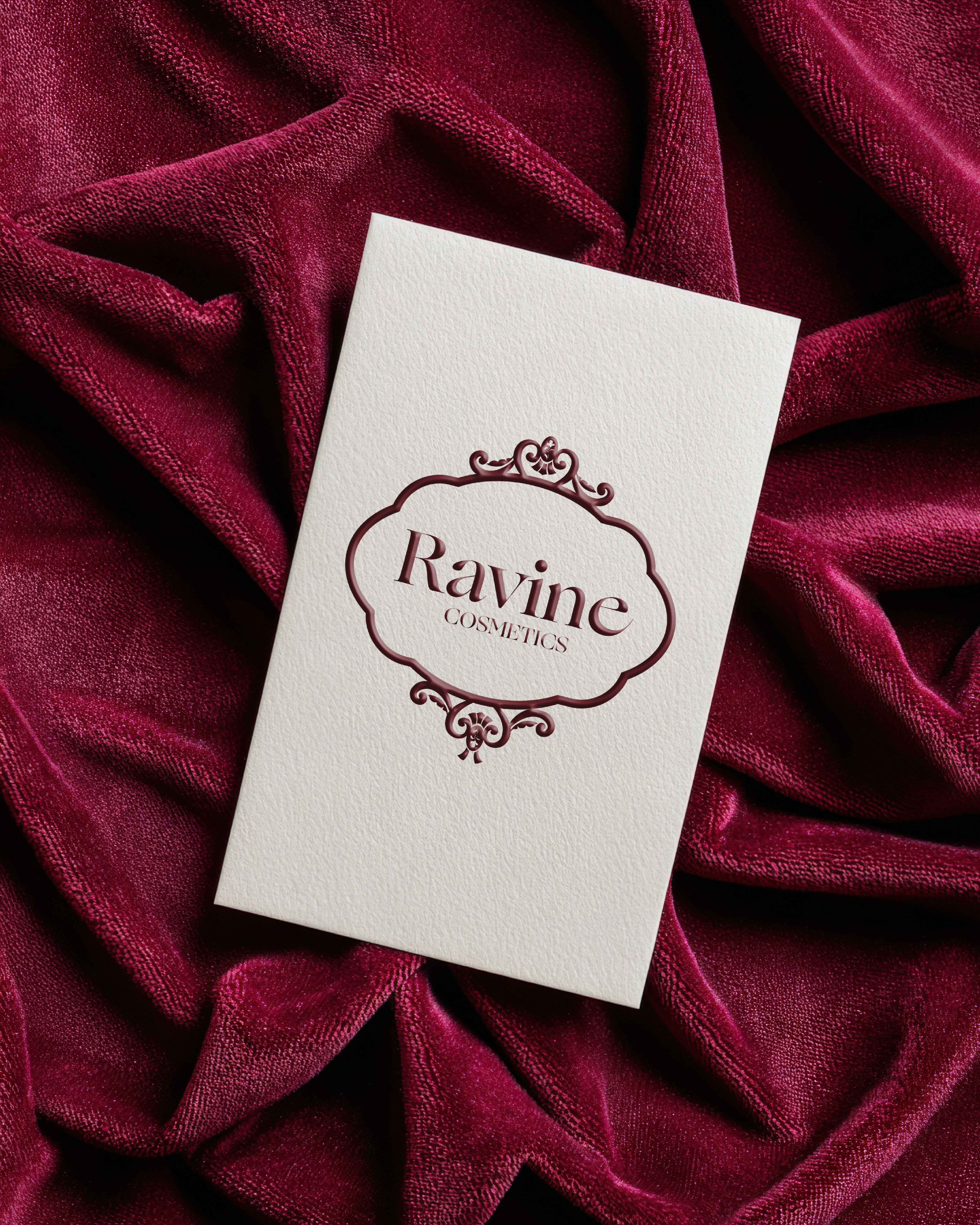
The colour palette was the first thing I locked in. Bordeux, Berry, Pink Tulle, and Chiffon — four shades that together tell a story of warmth, depth, and softness. From there, the ornate logo mark felt like a natural extension of that world; something vintage and considered, like a wax seal on a handwritten letter.
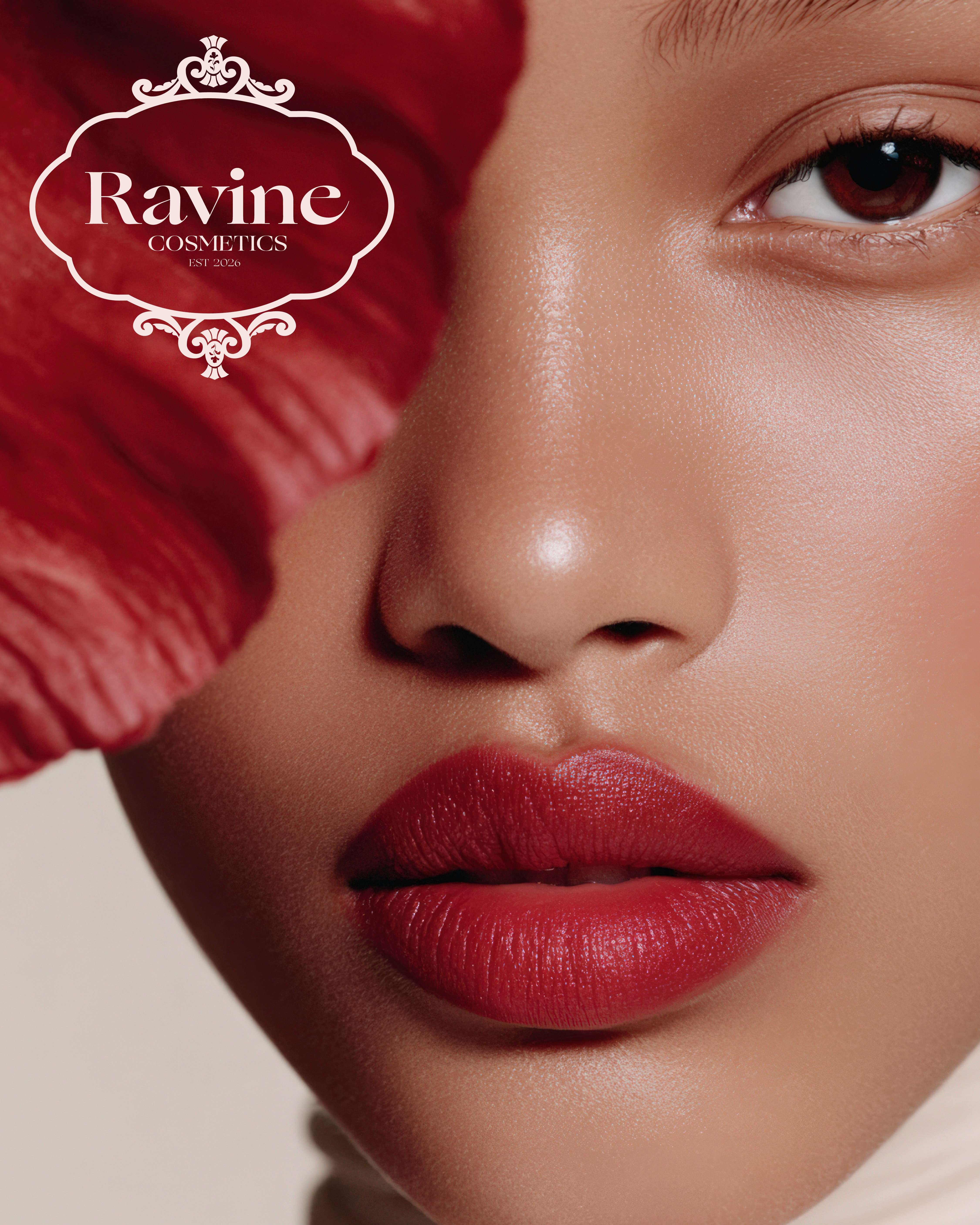
For the packaging, I leaned into dark florals and rich textures to ground the product in that same romantic aesthetic — luxurious without being cold, feminine without being delicate.
Overview
Ravine is a premium lip brand rooted in modern romance and natural sophistication. This project was a response to the @readysetbrief challenge, and from the moment I read the brief, I knew exactly the world I wanted to build — one that felt rich, tender, and deeply feminine.
The Concept
When I think of lipstick, I think of colour that carries emotion. The deep reds, the ripe burgundies, the soft berries — shades that feel bold and intimate at the same time. That tension between strength and softness became the creative heartbeat of Ravine.
I wanted the brand to feel like a love letter. Not loud or flashy, but the kind of romance that lingers — like velvet, like the last petal of a rose. Every decision I made came back to that feeling.
The Creative Decisions
The colour palette was the first thing I locked in. Bordeux, Berry, Pink Tulle, and Chiffon — four shades that together tell a story of warmth, depth, and softness. From there, the ornate logo mark felt like a natural extension of that world; something vintage and considered, like a wax seal on a handwritten letter.
For the packaging, I leaned into dark florals and rich textures to ground the product in that same romantic aesthetic — luxurious without being cold, feminine without being delicate.